
Massachusetts' latest weekly community-level data on the coronavirus pandemic, including the updated town-by-town risk assessment map, shows 77 communities considered at the highest risk for transmitting COVID-19, an increase of 14 from last week.
This week's report from the Department of Public Health was revamped to include data on isolated outbreaks, requiring its release to be moved back from Wednesdays to Thursdays. This is the first week of the new version.
Last week, Massachusetts climbed into the highest risk level, judging by the statewide average of all communities.
Get Boston local news, weather forecasts, lifestyle and entertainment stories to your inbox. Sign up for NBC Boston’s newsletters.
The data, from the Department of Public Health, includes a breakdown of the total number of coronavirus cases in each Massachusetts city and town, as well as the new map and more data.
See the Town-by-Town Mass. Coronavirus Risk Map
The following communities are in the highest risk level as of Wednesday: Abington, Acushnet, Ashland, Attleboro, Avon, Berkley, Boston, Boxford, Brockton, Buckland, Canton, Chelmsford*, Chelsea, Chicopee, Clinton, East Longmeadow, Everett, Fairhaven, Fall River, Framingham, Gloucester, Hanover, Hanson, Haverhill, Hingham, Holliston, Holyoke, Hudson, Kingston, Lawrence, Leicester, Lowell, Lynn, Lynnfield, Malden, Marlborough, Marshfield, Mattapoisett, Methuen, Middleborough, Middleton*, Milford, Millville, Milton*, Monson, New Bedford, North Andover*, Norwood, Oxford, Pembroke, Plymouth, Randolph, Raynham, Revere, Rochester, Rockland, Saugus, Scituate, Seekonk, Shrewsbury, Somerset, Somerville, Springfield, Swampscott, Tyngsborough, Wakefield, Waltham, Webster, West Bridgewater, West Newbury, Westfield, Westport, Weymouth, Winthrop, Woburn, Worcester, and Wrentham.
The asterisks, new in the state's revamped community-level coronavirus risk processing, mean that a local institution accounts for at least 11 cases in the community and those cases make up 30% or more of the community's total cases over the last two weeks.
These 23 communities are new to the list since last week: Ashland, Avon, Boxford, Buckland, Chicopee, Clinton, Gloucester, Lynnfield, Mattapoisett, Middleborough, Millville, Monson, Norwood, Raynham, Rochester, Scituate, Seekonk, Somerset, Swampscott, West Bridgewater, Westfield, Westport and Wrentham .
And Amherst, Auburn, Dartmouth, East Bridgewater, Holbrook, Littleton, Nantucket, Southborough and Sunderland have left the highest risk level since last week.
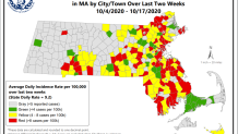
The map shows the number of cases detected on average each day over the last two weeks in each of Massachusetts' communities. More than 8 cases per 100,000 translates to a high risk and red shading, between 4 and 8 cases per 100,000 is moderate risk and any less than that is low risk.
There are 77 cities and towns shaded red in this map, an increase of 22% from last week's map. There were 63 communities on that map, which included data from Sept. 27-Oct. 10, an increase of 23 communities from the week prior.
The state's average itself entered the red zone last week, with the average incidence rate climbing to 8.7 cases per 100,000 people. This week the rate was up to 9.2.
Read this week's full report here, with data on communities' percent positivity, county- and state-level data and more.
Changes to Massachusetts' Hot Spot Map
Massachusetts has changed how it's measured coronavirus metrics over time, and this week brought a significant revamp that may address some small communities' concerns.
Thursday's report for the first time includes coronavirus clusters in institutions like jails, colleges and nursing homes. Such outbreaks have pushed communities into that red zone before.
"Adding this identification acknowledges the impact of a particular institution or facility on the community’s case count and provides valuable information for residents and municipal leaders to consider when implementing policies in their community," the state's COVID-19 Response Command Center said in a statement this week.
Having an asterisk won't change whether a city or and town can move forward or backward in Massachusetts' reopening plan or if more people can gather together, according to the command center. The asterisk doesn't change the red or yellow status.
"It matters that there’s a cluster anywhere because clusters are an opportunity for the disease to spread," said Dr. David Rosman, president of the Massachusetts Medical Society.
Rosman says just because there’s a cluster on a college campus, for example, doesn’t mean the rest of the community is in the clear.
“Young adults in a college setting can go to the local store, go to the local restaurant, and so their presence in a town counts, it actually does matter, because nobody ties them to their campus," Dr. Rosman said.
“Even if it’s a cluster it could be exposing other people in that same town," said Dr. Vibha Sharma, who specializes in infectious diseases at UMass Memorial Marlborough Hospital.
The color-coded town-by-town data was introduced in August, and the Baker administration announced that the state would focus its strongest COVID-mitigation efforts on towns in the red category. Communities can only move to Step 2 of Phase 3 of Massachusetts' reopening plan, announced in late September, if they are not consistently in the red.
Before the map's introduction, the positive COVID test rate over the preceding 14 days had been the standard for measuring hot spots. The Department of Public Health's weekly report still includes that information, along with other metrics like how many tests are being conducted locally and how many cases have been reported locally.
However, some of Massachusetts' smaller towns have taken issue with being categorized based on cases per capita.
They have said that, when a town only has a few thousand people, an outbreak in just one household can send it into red, which is determined by 8 cases of COVID-19 per 100,000 residents.
Asked earlier why he prefers using cases per capita instead of percent positivity, Gov. Charlie Baker said the latter doesn't take into account that some people get tested repeatedly.
"We have a lot of repeat testers in our data, many of whom are repeating for work-related reasons," Baker said.